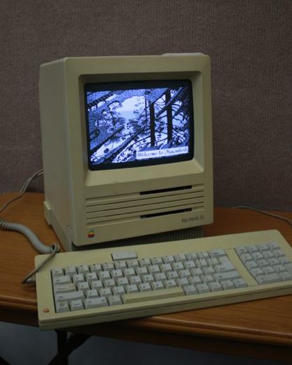
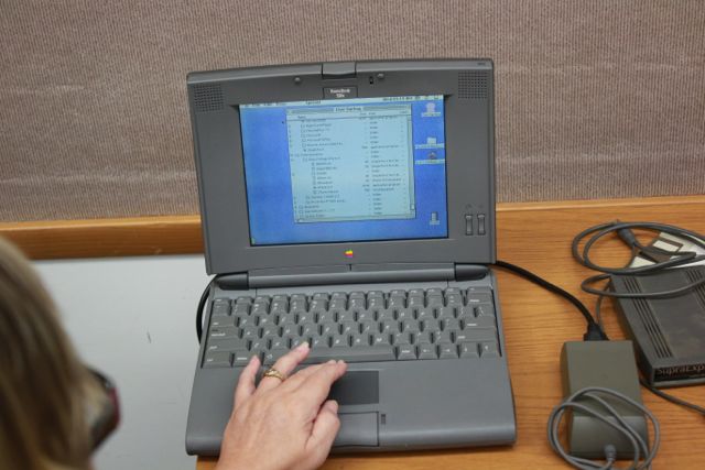
Eric Emerick’s Brevardian Podcast interviewed MacMAD, live at a meeting. The interview appears on the October 21st edition of the podcast. We covered some of the history and origins of MacMAD.
Author: Jamie Cox
Apple ID Sanity Check
If you will be buying a new Mac or iOS device soon, it really pays to get your ducks in a row as far as your Apple ID goes. Your Apple ID is more important than ever in the new operating systems, Yosemite for the Mac, and iOS 8 for the iPhone and its ilk.
Apple ID Is Your Single Credential for all Things Apple
If you have, or have ever had an iCloud account, Dot-Mac account, or Me.com account, you have an Apple ID.
Your single Apple ID is used for all these things:
- To access your email
- To buy music, movies and books & iOS apps from the iTunes Store
- To login to your computer
- For instant Messaging and FaceTime
- To access iCloud, including Photos and Find My iPhone and Find My Mac
- To buy hardware from store.apple.com
- To buy Mac software from the App store
- To sign in to the Apple Support Communities
- For Apple Pay
I’m probably forgetting something that should be in this list. It’s also used for developer access, if you are a registered developer with Apple.
Decide Which ID You Want To Use
If you’ve been using the Mac for a while, you may have more than one Apple ID. You probably want to settle on a single ID for your on-line life.
If you have been sharing an Apple ID with a significant other, you should get separate IDs. (It’s not that I don’t love you, but how can I send you a message if you don’t have your own ID?) Apple’s family sharing lets you share iTunes purchases with family members with their own accounts, so there’s no reason to use the same ID any longer.
Email Addresses
Although Apple has changed their mind several times about what domain they want users to use for email, they have done a good job of making it transparent. Email sent to [email protected], or [email protected] can be received at [email protected]. John Doe� can also use any of those to log on to his one iCloud account.
Apple could phase those older domains out some day, so use @iCloud as much as possible going forward.
It’s good policy for personal email addresses to belong to one and only one person. Some couples share an email address, but it’s a bad idea. One person can miss an email because the other one read it or deleted it. It can be awkward for your friends who are not sure which person they are addressing in an email. It’s certainly awkward if a couple separates for any reason — Who gets the email address?� And, when the inevitable happens, and one person passes away, it can be extremely weird for you to send, or your friends to receive, email from the account of a dead person.
Use Really Good Password Practices
The strength of your password is the only thing keeping bad guys from buying a new Mac and charging it to your credit card. Since your Apple ID is so important, you want to make sure you have a good password. Don’t use the same password for your Apple ID as you use for any other service! I’d say that 10-12 characters is long enough for a password these days. Make sure your password or simple modifications to it are not in any dictionary.� Mix in some numbers, caps and special characters.
In new installs, your login password on your Mac is� your Apple ID password by default.� That’s a pretty good idea, because it makes� you remember your Apple ID, since you’ll use it every day to login. If you just set up a new Mac, or just installed a new OS from scratch, you’ll likely get to a point where the machine restarts, and you are asked for a login password. If you’re like me, you’ll think “Panic! I don’t know the password because I haven’t created a password for this machine yet.” Well, don’t panic. The login password is your Apple ID password.
For greater protection,� you can enable two-factor authentication (aka two-step verification) for your Apple ID. This provides much better security for your Apple account. It eliminates social engineering attacks where the attacker is able to find out the answers to those lame security questions� (your mother’s maiden name, etc.), and get Apple to reset your password. With Apple’s two-step verification, your security becomes entirely up to you. Apple cannot help you if you forget. You are responsible for remembering your password. You will also be given a recovery code which you are responsible for keeping in a safe place where you can find it if needed.
Two-factor authentication isn’t for everyone. Read the instructions carefully before enabling it. You will have to use application-specific passwords for certain things. Make sure that doesn’t scare you before you commit to the change.
How To Replace Your PC
If you know a non-technical person who needs some straight-forward advice about getting a new computer or tablet, send them to http://www.howtoreplaceyourpc.com/ .
The site’s recommendations are primarily intended to help home users avoid malware and security problems. There’s a good chance that one reason the old computer is being replaced is that it is infested with malware.
The site is run by Neil Hutton, whose day job is cleaning viruses off user’s machines. With this experience he unsurprisingly gives high marks for security to iOS and Macintosh, and Windows is in the “just put a target on your back” category.
No tech jargon here. This is a site you can send your mom to. Enjoy.
How to Turn On an iMac
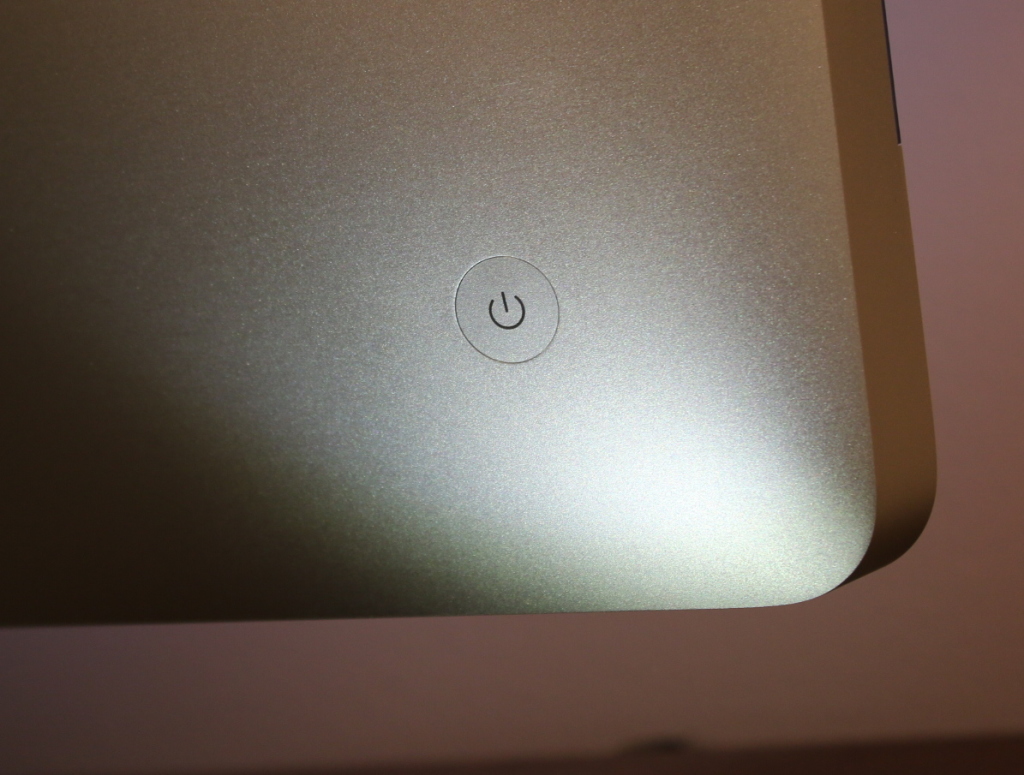
Otherwise knowledgeable users are baffled by one silly question when confronted with an iMac: How do I turn the computer on? Where’s the power switch? It’s not a stupid question. Apple has hidden the power button cleverly where you can’t possibly see it. It’s also very difficult to feel the button because it is flush with the case. If you do look back there, it’s probably hidden behind the curve of the case.
Anyway, here it is on a Mid 2011 iMac. It’s been in a similar position for several years. Glad to help, and don’t worry, we won’t tell anyone you had to look here to find out to turn on a Macintosh.
Combining MPEG Movies
I was looking for a straight-forward way to concatenate separate MP4 (MPEG 4) movies into a single movie. I am novice at all things video. I have at my disposal just some basic tools: iMovie, QuickTime Player, QuickTime Player 7 and MPEG Streamclip.
iMovie seemed like overkill. I couldn’t find any hint of a “concatenate” or “append” menu item in QuickTime Player or MPEG Streamclip.
Totally by accident, I found the trick in MPEG Streamclip. If you open multiple files at once, by command-clicking or shift-clicking them in the open dialog, MPEG Streamclip treats the group as one big video — instantly concatenating them together. It does not open multiple windows, but opens them all together in a single window as though they were a single continuous file.
Hopefully, you have named them in such a way that the sort order represents the order you want them to appear in the final video. Now, all you have to do is export that combined video into whatever format� you want. It will take a while, but you didn’t have to fool around with trying to cut and paste video segments, which wasn’t working for me at all, anyway.
Whacky Colors on Projector from MacBook Pro
I was doing a Keynote presentation recently, and had a problem with colors on a projector attached via a Thunderbolt-to-VGA adapter connected to a MacBook Pro. The first few slides in Keynote looked fine, but the first slide which contained a color photo, the colors in the photo were scrambled — sort of like a color negative. The black, white and gray on that slide and the on other slides looked fine.
I tried two different projectors and three VGA cables and the problem remained the same. The problem was also not just Keynote. It was any color image, including the default Mavericks desktop background (the wave). I think Keynote was actually masking the problem because my slides were mostly gray scale.
I was playing around with the color calibration controls (System Preferences/Displays/Color), in a desperate attempt to fix this, when the screen faded to black. When it came back, everything was fine. I didn’t think I had done anything which should be expected to fix anything that weird.
I had also lowered the screen resolution which didn’t seem to have any immediate improvement.
I failed to get a photograph of the problem. If anyone sees this happen again and can take a photo, I’d like to see it. I have reported this to Apple via feedback. It sounds very similar to a problem people were reporting back in about 2010.
I see no reason this wouldn’t happen on any other external monitor besides a projector.
[Edit: If you give public presentations in front of groups, you should have some color on your warm-up slides so you can notice if the projector colors are bad before you get into the main part of your presentation. Having a color photo on the first slide would have helped. ]
No Service Bug with iOS 8.0.2 and iPad 2
I patiently waited out the first couple of versions of iOS 8. After iOS 8.0.2 had been out for a while I figured it was safe to update my iPad. Not so. For iPad 2 users, iOS 8.0.2 has been causing loss of cellular data service. Obviously this only affects cellular capable iPads (3G models).
No real workaround is known. Rebooting the iPad restores service for a short time, but it soon fails again.
There is also no easy way to revert to iOS 7. So, DO NOT Upgrade to iOS 8.0.2 if you have a 3G iPad 2 and intend to use cellular data.
Apple has been slow to even acknowledge this bug, much less do anything about it.

Update Oct 13, 2014: Strange behavior — I connected my iPad to my Mac, but didn’t really do anything but transfer a picture to iPhoto. I noticed that the cellular service came back, although at one bar (I usually get 3 bars at home). It went to 3 bars, and stayed good for about a day, but is now back to “No Service”.
Update Nov 2014: This problem appears to be fixed by iOS 8.1. My iPad 2 has become glacially slow in recent updates, but that’s a separate issue.
How to Get Files Out of iCloud
Apple is doing its best to get users to use�iCloud. It does have its uses. iCloud saved my day when I was able to open Keynote as an iCloud web app on a Windows PC, and do my presentation from iCloud just like I was in Keynote on my Mac. That was nice.
Sometimes, though, there is just no substitute for having your own files on your own hard drive. There’s no place like home. Apple makes it surprisingly hard to move files between iCloud and your own storage. Unlike, say, Dropbox, iCloud doesn’t integrate with the Finder. Really? Third party software works better with MacOS than iCloud does? Don’t ask me why Apple would ever do that.
The document-oriented Apple apps that use iCloud are Preview, TextEdit, iMovie, Keynote, Pages and Automator.
Instead of using the Finder, iCloud documents can only be manipulated from within Applications. You can use the Move To… or Export… menu options to move or copy a single�open file from iCloud to local storage or vice versa.
The screenshot below shows how to drag�multiple files from iCloud to the Finder. The window on the right is the open-file dialog for the Preview Application. On the left is a finder window. The default behavior is to move the files. If you want to copy instead, hold the option key while dragging.
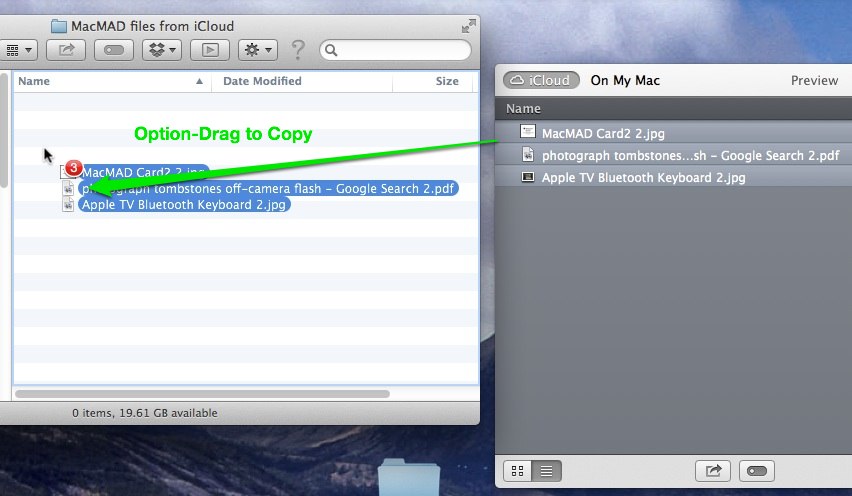
Since each application can only see its own files in iCloud, you must repeat this operation in each application that has files to be moved.
You may notice that there are no folders or directories in iCloud — just a big list of files.
Apple seems determined to move users away from the file system paradigm. Since the file system is probably the most successful and widely used abstraction in all of�computing, it’s certainly daringly Avant Garde of Apple to try to ignore it. However, I’m afraid that they are doing so to increasingly limit user’s options and further corral us�into Apple’s walled garden.
The file system is a powerful abstraction in which the relationship between files and applications that act on those files is not pre-determined. It puts a lot of power into the hands of the user who gets to decide who does what to what file, and which file goes where. The current, featureless iCloud takes that power away.
Favorite Tip: Drag To Open
Here’s one of my favorite Mac tips. This is a workflow tip. Most of the time,�when opening a file in an application, you are not doing this in isolation. You are working on a project. There may be many steps and many files. You probably have the project folder already open in a Finder window.
When you select File/Open in the application, however, it shows the last place you opened a file, which is probably not where you want to be. It’s irritating to have to navigate from there back to the project folder which you�already located in the Finder once.
You don’t need to do that. You can drag the icon of a file or folder into the open-file dialog box. Unlike dragging to a Finder window, it doesn’t copy or duplicate anything. Instead, it instantly navigates the open dialog to the folder containing your file, with the file selected.
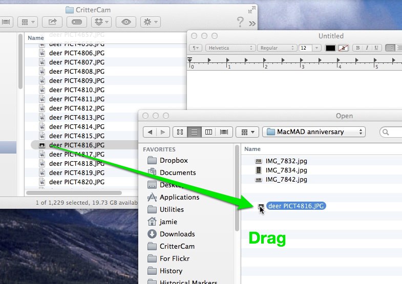
As soon as you drag it in, the dialog shows the dragged file selected in its enclosing folder, ready to be opened.
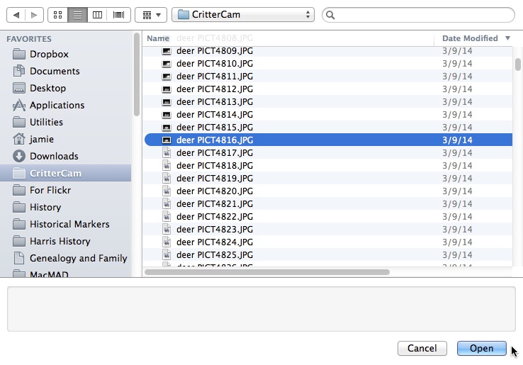
Congratulations, you’ve just saved who knows how many clicks navigating to the desired folder.
MacMAD 30th Anniversary Event
MacMAD’s 30th Anniversary Event is history. It was fun to see some faces and equipment from the past. Naturally we ate dinner at San Remo Restaurant, haunt of MacMAD back in the 1980s and 1990s, and still good.

