I recently got my first iPhone after having an Android phone. What was that experience like, and were there any pitfalls?
At the AT&T store, when buying the new phone, the guy asked if I wanted him to transfer my phone data to the new phone. They have some software and cables to do this. I said no. I knew it would take a long time, work imperfectly, and I wanted to start fresh. Although there might be a couple unique things on the old phone, the important stuff was all in the cloud. I was still going to have my old phone if I needed something from it. I wasn’t trading it in or anything. (It’s apparently worth less than $10 on resale sites.)
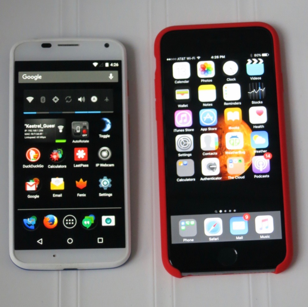
Moto X 1st Gen to iPhone 6s, Both on AT&T
My old phone was a Motorola Moto X, first generation. I liked it a lot, but it was two years old, and the battery was about shot. I have been a Macintosh user forever, so it is a little surprising I didn’t get an iPhone sooner. So, why now? Partly it is because of the iPhone’s superior security, and continuing announcements of serious vulnerabilities in Android. Some of these affected my Moto X and didn’t get patched promptly. On the Apple side, I did not like being at the complete mercy of on-line advertisers. Now that iOS has at least some ad blocking capability, an iPhone became a real option for me.
2nd Factor Authentication
If you aren’t using 2nd factor authentication, or don’t know what it is, you won’t need to worry about this.
I have several on-line accounts set up with 2nd factor authentication: in addition to my password to login, I must provide a code. The code comes from a text message sent to my phone, or from the Google Authenticator App running on my phone. Getting a new phone made me realize how incredibly inconvenient it would be to lose my phone for any reason. If you use 2nd factor authentication, make sure that you have backup authentication methods for your accounts. The backup method can be one-time codes printed on paper and stored in a safe place, or it can be a second phone, maybe a family member’s phone. If you don’t have a backup method, you could lose access to your account(s) permanently.
I probably spent more time on 2nd factor authentication than on any other aspect of getting the new phone. For most services, I had to disable and re-enable 2nd factor authentication to get it to recognize my new iPhone Google Authenticator App.
I was pleased that AT&T asked for my ID before issuing me a new phone. I’m sure that was mostly to avoid fraudulent purchase of phones, but it also makes sure that no one else gets my phone number, and thus can receive my authentication codes.
Contacts
Since I already had a Macintosh, I already had contacts from my Mac stored in iCloud. However my Android phone kept its contacts in Gmail. I have been using a Mac App called Contacts Sync for Google Gmail for some time to keep my Mac Contacts synchronized with Gmail. So, I didn’t really need to do anything special for my contacts to appear on my new iPhone. As soon as I connected to my existing iCloud account, there they were. Important note: if you already have an iCloud account, make sure you know what it is when getting a new Apple device. Don’t create a new account. You will be much better off if all your Apple devices are associated with the same iCloud account.
Apps
I went into the iPhone App store where I found the iPhone equivalent of most of my favorite apps, usually by the same developers. My favorite apps from Google and Amazon had iPhone counterparts as did social media apps, remote control apps for various gadgets, and magazine & newspaper apps.
I set up Apple Pay/Apple Wallet as the counterpart to Google Wallet/Tap & Pay/Android Pay.
I’m still looking for a favorite Twitter client. I hate the stock iPhone Twitter app.
I used to have an iPad, so I found some of my old favorite apps (paid & free) that I used to have on the iPad. Universal apps I had paid for in the past on the iPad were still available to re-download on the new iPhone without buying them again.
Music and Podcasts
Since I already had iTunes, as soon as I connected my iPhone to my computer, I was able to transfer my music, podcasts and videos to my new phone without a problem. Any music I have bought from Amazon or Google, or outside of iTunes, I have routinely imported into iTunes, so it was ready and waiting to be synced to the new iPhone.
Comparisons
I love Touch ID. This is a great feature on the iPhone. It means I can keep my phone securely locked, but it’s always unlocked for me because it recognizes my fingerprint. I didn’t know this, but you can register more than one fingerprint, which is convenient because sometimes you hold the phone in different positions. You can also use Touch ID to authorize things within Apps, such as buying from the iTunes music store, or paying at the register with Apple Pay. For example, it unlocks my LastPass password manager App. When choosing a case for your iPhone, make sure it doesn’t obstruct the home button (Touch ID sensor) at all.
The Moto X had its own convenience unlock feature.� It was based on NFC and was called Motorola Skip. The phone unlocks when you hold it near a unique physical tag. I lost two of the magnetic Skip clip tags, probably because they were magnetic, and they tended to stick to cars and refrigerators, etc. Even so, this was a pretty cool feature. However, it wasn’t in any other Android phones I know of, and is no longer offered in the newer versions of the Moto X.
I was getting annoying accidental photos and my Moto X would wake up in my pocket and do weird things. I set it to lock instantly, and this prevented it taking photos inside my pocket, or activating apps, but it could still try to butt-dial using the emergency dialer. There didn’t seem to be any way to prevent this. One time it dialed “9116”, which is disconcertingly close to accidentally calling 911. So far, I haven’t seen this happening at all with the iPhone. I think it’s because waking up the iPhone requires a physical press of the home button — not just a vibration and/or a screen swipe.
The new iPhone has WiFi calling and “HD Voice”. I’m happy about anything that can improve cell phone voice quality. On Android, I made WiFi calls using Google Hangouts. That improved audio quality and allowed calling from areas with poor cell coverage, but added some annoying latency (delay). I’m not sure I’ve used WiFi calling on the iPhone yet. It’s enabled, but I don’t know how to tell if it’s really working other than by visiting someplace with no cell service that has WiFi. HD voice is apparently enabled automatically on AT&T on compatible iPhones with iOS 9.2. My calls sound really great so far on the iPhone.
The Moto X had an AMOLED screen, with a cool notification feature. It could wake up momentarily in a minimalist, low-power, monochrome mode where it just shows the time and any texts, voice mails, etc. This mode can be activated by just moving the phone, so it is very easy to check the time. You don’t need to unlock your phone to see the time, or check notifications. Even though the display was usually blank, all you have to do is get your phone out of your pocket and look at it to see the time. The motion of doing so was sufficient to activate the time display. Again, this was a feature of this particular phone — it’s not present in newer versions, other Android phones, or the iPhone.

I miss Android’s back button in the lower left. The iPhone doesn’t have this. The same functionality is available in apps, but it is located in various spots on the screen, instead of a consistent location.
I think the App permission system is nicer on the iPhone. In iOS, you can enable/disable App notifications and permissions whenever you want in Settings. On Android, you have to either accept an App with all the permissions it wants, or ditch the entire App. iPhone apps can nag you when they want to access something, but you don’t have to grant access.
For notifications, the iPhone lets you decide whether each app can issue notifications at all, can make a sound, can put a notification badge on the app, and whether it can show on the lock screen. Nice. The Android notification system is less flexible for the user.
On Android, I was being nagged to upgrade apps which suddenly wanted access to my camera or microphone, when this was never needed before. There was no way to get the update and still say no.
Many of the newer Android phones are just too damn big for me, so that was one factor in choosing the iPhone. I’m not a fan of these giant phablet phones. The Moto X was modestly sized and fit in my pocket. The iPhone 6s is very close to the same width, but is maybe a half-inch taller than the Moto X. The iPhone is thinner, so overall, reasonably sized.
The iPhone fits in two more rows of icons than the Moto X. That’s another eight icons per home screen. Nice. That’s partly because of the phone being bigger, and also because it doesn’t have the redundant Google Search bar on every page. I do wish I could place the icons where ever I wanted instead of having them autofill from the top.
There really isn’t that much difference in the experience between high-end Android� phones and the iPhone. But, I think the iPhone 6s is the best phone for me right now, and I’m happy with it.