Quicken 2016 for Mac is still sadly inferior to the Windows version even going back to 2011. For one thing, it doesn’t handle scheduled transactions nearly as well.
That’s all for now.
Quicken 2016 for Mac is still sadly inferior to the Windows version even going back to 2011. For one thing, it doesn’t handle scheduled transactions nearly as well.
That’s all for now.
Here are the slides from MacMAD’s February talk about Apple’s Photos app:
I was looking for a straight-forward way to concatenate separate MP4 (MPEG 4) movies into a single movie. I am novice at all things video. I have at my disposal just some basic tools: iMovie, QuickTime Player, QuickTime Player 7 and MPEG Streamclip.
iMovie seemed like overkill. I couldn’t find any hint of a “concatenate” or “append” menu item in QuickTime Player or MPEG Streamclip.
Totally by accident, I found the trick in MPEG Streamclip. If you open multiple files at once, by command-clicking or shift-clicking them in the open dialog, MPEG Streamclip treats the group as one big video — instantly concatenating them together. It does not open multiple windows, but opens them all together in a single window as though they were a single continuous file.
Hopefully, you have named them in such a way that the sort order represents the order you want them to appear in the final video. Now, all you have to do is export that combined video into whatever format� you want. It will take a while, but you didn’t have to fool around with trying to cut and paste video segments, which wasn’t working for me at all, anyway.
Apple is doing its best to get users to use�iCloud. It does have its uses. iCloud saved my day when I was able to open Keynote as an iCloud web app on a Windows PC, and do my presentation from iCloud just like I was in Keynote on my Mac. That was nice.
Sometimes, though, there is just no substitute for having your own files on your own hard drive. There’s no place like home. Apple makes it surprisingly hard to move files between iCloud and your own storage. Unlike, say, Dropbox, iCloud doesn’t integrate with the Finder. Really? Third party software works better with MacOS than iCloud does? Don’t ask me why Apple would ever do that.
The document-oriented Apple apps that use iCloud are Preview, TextEdit, iMovie, Keynote, Pages and Automator.
Instead of using the Finder, iCloud documents can only be manipulated from within Applications. You can use the Move To… or Export… menu options to move or copy a single�open file from iCloud to local storage or vice versa.
The screenshot below shows how to drag�multiple files from iCloud to the Finder. The window on the right is the open-file dialog for the Preview Application. On the left is a finder window. The default behavior is to move the files. If you want to copy instead, hold the option key while dragging.
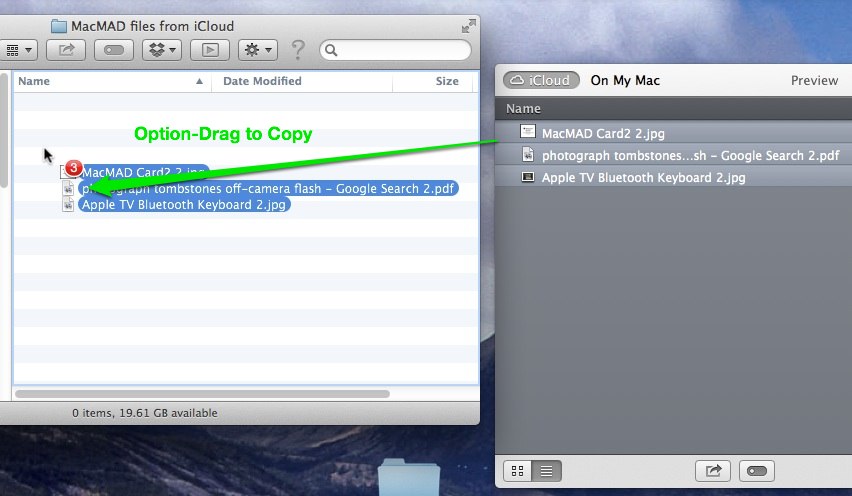
Since each application can only see its own files in iCloud, you must repeat this operation in each application that has files to be moved.
You may notice that there are no folders or directories in iCloud — just a big list of files.
Apple seems determined to move users away from the file system paradigm. Since the file system is probably the most successful and widely used abstraction in all of�computing, it’s certainly daringly Avant Garde of Apple to try to ignore it. However, I’m afraid that they are doing so to increasingly limit user’s options and further corral us�into Apple’s walled garden.
The file system is a powerful abstraction in which the relationship between files and applications that act on those files is not pre-determined. It puts a lot of power into the hands of the user who gets to decide who does what to what file, and which file goes where. The current, featureless iCloud takes that power away.
“For the most part, try to create modeless features that allow people to do whatever they want when they want to in your application. Avoid using modes in your application because a mode typically restricts the operations that the user can perform while it is in effect. If an application uses modes, there must be a clear visual indicator of the current mode” -Macintosh Human Interface Guidelines, Apple Computer 1995
This article was written with respect to iTunes version 11.2.2, 2014. Your version may vary.
Don’t Mode Me In
Many users, especially novices, have trouble navigating the iTunes interface. I am often asked the question: Where is that control or feature I saw in iTunes previously? I can’t find it. These difficulties can be traced to the confusing number of modes iTunes has. iTunes started out years ago as a music player. It has since taken on many additional functions such as interface to the iTunes store, movie player and control center for iOS devices.
Understanding the way iTunes modes work will help you use the program, but will also reveal why it needs a complete overhaul. Let’s take a look at the iTunes interface.
iTunes has three major modes and at least 30 minor modes. Larry Don’t-Mode-Me-In Tesler of the original Mac design team must be totally revolted by this. iTunes’ major modes are:
Generally, important user interface functions are located at the upper left, like the home button on a web page. Bizarrely, iTunes puts these major mode controls way over on the right side of the window.
iTunes only allows a single window to be open, so these modes all operate to change the function of iTunes’ single main window. The controls available in each mode vary in an inconsistent manner, as we will see. The table below shows the major mode navigation available by default in iTunes. There are buttons in the upper left to change modes. However you cannot get directly from the iTunes Store to your iDevice or vice versa, without first going through the Library. Weird.
To read this table, find the mode you are currently in on the left. Then find the mode you want to be in at the top. The intersection shows you if that’s possible. For example, if you are in the iTunes Store, and you want to see your attached iPhone, well, you can’t get there from here. But, you can go from the Store to the Library, and then from the Library to the iPhone.Weird, huh? When the table says “Button”, there is an appropriate button at the upper right of the iTunes window.
With the number of modes in iTunes and the weird controls for accessing them, it’s a virtual certainty that most users have never even seen most modes. They may need or want something that those modes can do, but they have never found their way to it. If they do happen to stumble across something they like, they are unlikely to be able to find their way back to it later.
The Sidebar
The table above is strictly true only if you have not enabled iTunes’ sidebar. It is hidden by default. With the sidebar visible, you now have the ability to navigate directly from any mode to any other. This is reason enough for me to show the sidebar.
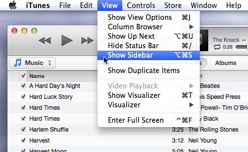
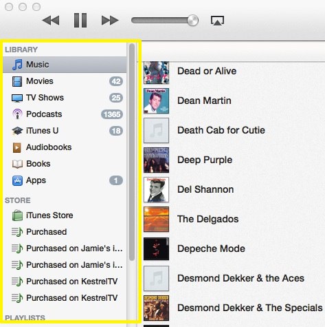
But, when you show the Sidebar, the mode buttons on the upper right disappear. What?! Seriously?
Same Name, Different Things
Want to see something else weird? Supposed you want to review your iTunes store purchases. The sidebar offers a Purchased link under STORE. There is also a Purchased link under QUICK LINKS on the iTunes store home page. These two links lead to two very different modes. The sidebar link, despite being under the STORE heading, does not open the store, but leads to a playlist of all the media in your library that was previously purchased. The other Purchased link shows a list of things in the context of the iTunes store that you have purchased on any device. From there, you can download any of them that may not be in your library.
So, the Purchased links in the sidebar under STORE are actually playlists in your library, not in the store, but they are not listed under PLAYLISTS, but are listed under STORE. Everybody clear on that? Makes total sense.
Similar Choices, Different Controls
When you are in your library, iTunes offers a choice of sub-modes: Music, Movies, TV Shows, Podcasts, etc. These choices are presented in a pop-up control on the upper left. The iTunes store has a nearly identical list, but how are they presented? As a series of buttons across the top of the screen. Why do these have to be different?
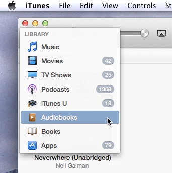

Does nobody review this software before it is released?
Don’t Forget to Sync
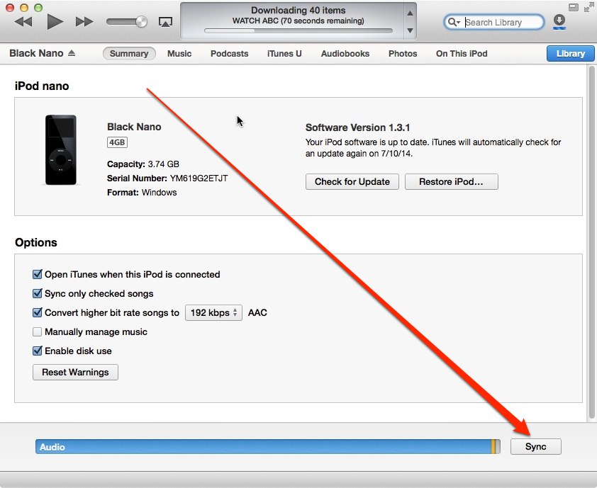
If you are using iTunes to load music or videos onto your iGadget, arguably the most important control in iTunes is the Sync button. If you don’t Sync, none of your changes are applied, and you have accomplished nothing. This all-important button is in the lower-right corner of the iTunes window, where nothing else in iTunes ever appears. It’s all too easy to overlook.
It’s Not Just You
I hate helping people with iTunes because I end up apologizing for how terrible it is. If you’re new to iTunes, at least now you know, it’s not just you — iTunes really is that weird. Maybe you’ll now have a better idea of what it does and how to get there.
P.S. Why, oh why does iTunes only have one window? If I could change only one thing, this would be it. I would like to have my library visible while shopping the iTunes store. Is it too much to ask?
If it hasn’t happened to you yet, it will soon. Your phone or someone’s near you will alarm loudly, and you will see an important-looking message. �This is the government-mandated Wireless Emergency Alert system in action.
This is an alert I received this morning on my android phone:
A system like this depends on user acceptance to function properly. So far, the main reaction of users has been “How do I turn this off”? Why?
There are several serious problems with this particular alert and the system in general. First of all, the alert on Android is presented as a one-time modal dialog box. You have to press OK before you can do anything else. Most people will do that within seconds. On my phone, at least, once OK is pressed, the alert is gone. You have no way to retrieve or review it. How many people will remember the license plate number even a minute later?�The only way I could capture the alert dialog was to take a picture of it with another phone. I �understand that on iOS, the alert remains visible in the notification center. Can anyone confirm that? Two points for Apple if so.
I have no confidence in a system where I cannot review past history. Alerts should remain reviewable for some time, even if they are cancelled, if they appeared on my phone once, I should be able to look at them again.
The second problem is that the alert does not say who sent it. My first question on seeing one of these for the first time was, what app generated this alert? I had installed some weather apps, maybe it was one of those. I was vaguely aware of the WEA system, but wasn’t sure if that was the source of the alert I was seeing. The question of who sent the alert also applies at the agency level. Did this come from the governor, the corner police station, who?
Problem number three, the alert doesn’t say what to do. What do I do if I see the missing pickup? The weather alert said to turn on the TV, I believe, which is a little more useful. I can’t check that though, because there is no way to recall past alerts.
The fourth problem, is there is no way to get more information. Any half-baked messaging app will let you click to see a photo or web page. How about some photos of the missing person, the vehicle and the suspect? How about a weather map of the tornado warning area? We get none of that.
Another, less serious, problem is that users are unfamiliar with these alerts. They have never seen them before. I would suggest that in the settings for WEA, there be a button for users to generate a demo alert, just on their own phone, so they can see what the alerts look and sound like.
Ask about these problems, and you will hear that there are technical limitations — the system only allows 90 characters of text. I must say, that’s a pretty bad design. What do you expect from a government design? It needs to be changed. Some high school students could make a better system than this in an afternoon.
WEA (Wireless Emergency Alert) Overview
WEA sends alerts through the cellular system. The alerts are sent only to phones and cell towers in the affected area. The system only operates on relatively new phones. On AT&T, the Apple models supported are the iPhone 4S, iPhone 5, 5C and 5S.
The switches to turn off Amber Alerts and Emergency Alerts in iOS are in Settings/Notifications/Government Alerts. There is still the “Presidential Alert” which cannot be disabled.
I haven’t been able to determine for sure whether WEA alerts are supported on any model of iPad or not. They are not happening on mine which does have cellular.
Links
A good blog post about problems with WEA
2014 MacMAD Election results:
Miscellaneous Notes:
Dan Wadler presented on Free Software
He showed us some perhaps lesser-known Mac freeware. All links current as of March 2014.
www.macupdate.com – a good place to look for software if you don’t know what apps are out there
Libre Office – A free office suite including Word processor, Spreadsheet, Presentation, Drawing and Database applications.
Stellarium – Cross-platform Planetarium software – see the stars and planets from your location and time – with modules and plug-ins. Yes, there’s an exoplanets plug-in.
Celestia – Real-time 3D visualization of space
Tide Widget – tide forecasts for your location – in a Dashboard widget
Album Artwork Assistant – Helps find Cover Artwork for iTunes
VLC Media Player – plays video in a great variety of digital formats
MacTubes – Play and download YouTube videos
MacTracker – detailed specifications for everything Apple Computer ever made
The Unarchiver – quick and easy app to open many different archive file types: zip, Tar etc.
Free Browsers: Chrome, Firefox, Opera, Dolphin (iOS), Mercury (iOS), Omniweb
Free Cloud Storage sites: Dropbox, Copy and Box.
Calibre – eBook manager
Sophos – Free Antivirus. Also, ClamX AV free antivirus.
Chess Knight – not overly tough computer chess game
Free Password managers: KeePass and LastPass.
Club elections will be next month in March – round up the usual suspects.
Upcoming meeting topic suggestions mentioned
The Mac OS features Spaces and Expos� were combined into Mission Control in 10.8, Mountain Lion. These tools are all about managing your multiple desktops and open windows.
Products Mentioned in the Meeting
Dinner after the meeting was at Steak and Shake.