In the process of helping older people with their iPhones and iPads, I have noticed certain problems common to many older users and solutions for some of those problems.
Unintended Actions
The first type of problem is unintended actions. This is when someone intends to do one thing, but accidentally does another. This can be as simple as typing the wrong character, but often includes major things like accidentally opening another app or pressing delete instead of save. I often see accidental swipes. The user intends to press a button or icon, but, perhaps due to poor motor control, instead swipes. Depending on the context, and where a swipe occurs, surprising things happen: the search window pops up, an email is deleted, etc.
One person asked me what the control center was and why it keeps popping up from the bottom of the screen. This was happening when she accidentally swiped up from the bottom of the screen invoking the control center.
You can make this less likely by turning off the control center from within apps. It can still appear on the home screen, but won’t pop up within any app. This setting is in Settings:Control Center:Access Within Apps.
I turned that off on my own phone and realized that I had probably been invoking Control Center more often by mistake than on purpose.
Touch Accommodations
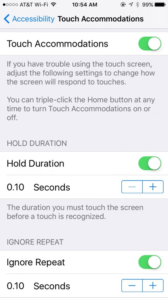
Another very useful setting is in Settings:General:Accessibility:Touch Accommodations. If you turn on Touch Accommodations, the whole touch screen interface becomes less sensitive, and requires more deliberate actions. Buttons and other controls won’t activate until you press them for at least 1/10 of a second. That doesn’t sound like very long, but it makes a huge difference. Many accidental swipes and clicks will be eliminated.
Once enabled, you can adjust the delays. The default durations are probably okay for most people. If the user has severe tremors, then these settings can be increased. It might take a little bit of time to get used to this mode, but it can be worth it.

Overlooked Controls
The second category of problem is the “Oh, I didn’t know you could push that.” problem. iOS conceals many options behind innocuous looking symbols or words which are actually buttons that you can click, leading to useful functions. Often, people don’t notice those, or don’t realize that they are buttons.
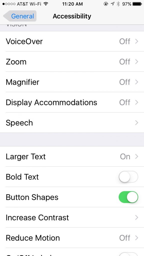
There is a setting, General:Accessibility:Button Shapes, which outlines text buttons with a grey shape, making them look more like buttons. For example, notice how the word General has a gray background in the screen shot below.

Try these settings for yourself or for your older friends and relatives. They could lead to a calmer, less frustrating experience with the iPhone or iPad.