“For the most part, try to create modeless features that allow people to do whatever they want when they want to in your application. Avoid using modes in your application because a mode typically restricts the operations that the user can perform while it is in effect. If an application uses modes, there must be a clear visual indicator of the current mode” -Macintosh Human Interface Guidelines, Apple Computer 1995
This article was written with respect to iTunes version 11.2.2, 2014. Your version may vary.
Don’t Mode Me In
Many users, especially novices, have trouble navigating the iTunes interface. I am often asked the question: Where is that control or feature I saw in iTunes previously? I can’t find it. These difficulties can be traced to the confusing number of modes iTunes has. iTunes started out years ago as a music player. It has since taken on many additional functions such as interface to the iTunes store, movie player and control center for iOS devices.
Understanding the way iTunes modes work will help you use the program, but will also reveal why it needs a complete overhaul. Let’s take a look at the iTunes interface.
iTunes has three major modes and at least 30 minor modes. Larry Don’t-Mode-Me-In Tesler of the original Mac design team must be totally revolted by this. iTunes’ major modes are:
- Library Mode – You are browsing content in your iTunes library on your own computer
- iTunes Store – You are browsing content available for sale, rent or download from Apple
- iDevice Mode – You are browsing and configuring an attached iOS device or iPod
Generally, important user interface functions are located at the upper left, like the home button on a web page. Bizarrely, iTunes puts these major mode controls way over on the right side of the window.
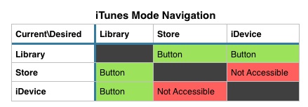
iTunes only allows a single window to be open, so these modes all operate to change the function of iTunes’ single main window. The controls available in each mode vary in an inconsistent manner, as we will see. The table below shows the major mode navigation available by default in iTunes. There are buttons in the upper left to change modes. However you cannot get directly from the iTunes Store to your iDevice or vice versa, without first going through the Library. Weird.
To read this table, find the mode you are currently in on the left. Then find the mode you want to be in at the top. The intersection shows you if that’s possible. For example, if you are in the iTunes Store, and you want to see your attached iPhone, well, you can’t get there from here. But, you can go from the Store to the Library, and then from the Library to the iPhone.Weird, huh? When the table says “Button”, there is an appropriate button at the upper right of the iTunes window.
With the number of modes in iTunes and the weird controls for accessing them, it’s a virtual certainty that most users have never even seen most modes. They may need or want something that those modes can do, but they have never found their way to it. If they do happen to stumble across something they like, they are unlikely to be able to find their way back to it later.
The Sidebar
The table above is strictly true only if you have not enabled iTunes’ sidebar. It is hidden by default. With the sidebar visible, you now have the ability to navigate directly from any mode to any other. This is reason enough for me to show the sidebar.
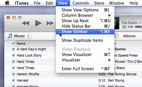
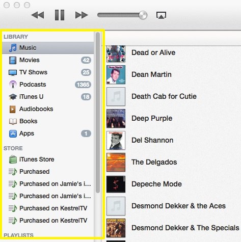
But, when you show the Sidebar, the mode buttons on the upper right disappear. What?! Seriously?
Same Name, Different Things
Want to see something else weird? Supposed you want to review your iTunes store purchases. The sidebar offers a Purchased link under STORE. There is also a Purchased link under QUICK LINKS on the iTunes store home page. These two links lead to two very different modes. The sidebar link, despite being under the STORE heading, does not open the store, but leads to a playlist of all the media in your library that was previously purchased. The other Purchased link shows a list of things in the context of the iTunes store that you have purchased on any device. From there, you can download any of them that may not be in your library.
So, the Purchased links in the sidebar under STORE are actually playlists in your library, not in the store, but they are not listed under PLAYLISTS, but are listed under STORE. Everybody clear on that? Makes total sense.
Similar Choices, Different Controls
When you are in your library, iTunes offers a choice of sub-modes: Music, Movies, TV Shows, Podcasts, etc. These choices are presented in a pop-up control on the upper left. The iTunes store has a nearly identical list, but how are they presented? As a series of buttons across the top of the screen. Why do these have to be different?
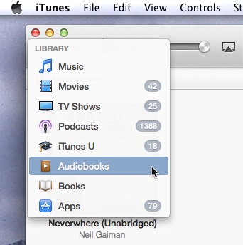

Does nobody review this software before it is released?
Don’t Forget to Sync
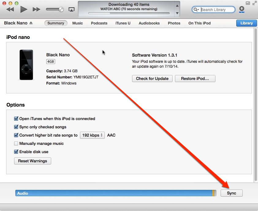
If you are using iTunes to load music or videos onto your iGadget, arguably the most important control in iTunes is the Sync button. If you don’t Sync, none of your changes are applied, and you have accomplished nothing. This all-important button is in the lower-right corner of the iTunes window, where nothing else in iTunes ever appears. It’s all too easy to overlook.
It’s Not Just You
I hate helping people with iTunes because I end up apologizing for how terrible it is. If you’re new to iTunes, at least now you know, it’s not just you — iTunes really is that weird. Maybe you’ll now have a better idea of what it does and how to get there.
P.S. Why, oh why does iTunes only have one window? If I could change only one thing, this would be it. I would like to have my library visible while shopping the iTunes store. Is it too much to ask?


Thanks to Adam Baker for linking to this post from his (long!) article The Post-Mac Interface .